R vs Power BI
What you will learn
- Understand typical uses of R and Power BI;
- Be able to identify how R and Power BI can enrich your analysis;
Table of Contents
- 1. What is R?
- 2. What is Power BI?
- 3. R vs Power BI
- 4. R vs Power BI for digital humanities
- 5. R vs Power BI - Examples
- 4. Conclusions
1. What is R?
R is a programming language and an environment for statistical computing and visualization. R is not a general-purpose programming language, like Python or Java, because its focus is on statistical computing. The language is very popular in the academic environment and allows for complex calculations and algorithms.
2. What is Power BI?
Power BI is a set of softwares and applications focused on data analysis and visualization for Business Intelligence. For this article, when we talk about Power BI, we refer to Power BI Desktop, a drag and drop application used to transform, analyse and visualize data.
3. R vs Power BI
Below, a list of the main differences and similarities of R and Power BI is presented for several aspects:
- Scope: While R is more suitable for academic and complex statistical data analysis, Power BI is more adequate for quick visual analyses. While R is common in the academic context, it can also be used in companies and industries that leverage data science for decision making. In this case, R would be used to prepare the data, train models and the Power BI to visualize the findings;
- Learning Curve: Power BI is user-friendly and allows the creation of beautiful visualizations with a few clicks. R, on the other hand, has a steep learning curve. It requires a lot more training and reading more complex documentation before you can produce effective visualizations;
- Interface: R is a written programming language, while most of tasks in Power BI are achieved with drag and drop actions;
- Data Visualization: Power BI is limited in its visuals and customization options of reports and graphs, while R is flexible and versatile. There are many more chart types that can be plotted in R compared to Power BI. On the other hand, it is much easier and faster to plot appealing visualizations in Power BI compared to R;
- Data Analysis: R provides libraries for advanced statistical operations that allow statistical inference, causal inference, machine learning and more complex analysis. Power BI is more suitable for answering simple Business Intelligence questions.
- Price: Both platforms are free, but companies offer paid tools to enrich their functionalities.
4. R vs Power BI for digital humanities
R as well as Power BI might be used for digital humanities. R is perfect for analyses and visualizations for a scientific article. It is also the right option if you would like to implement complex algorithms. Power BI is a great fit if you would like to easily produce beautiful plots and enable user interactivity for a broader audience.
In education, for example, Power BI could be used to produce an interactive dashboard exploring the casualties of World War II. This could be used to teach history or bring insights to researchers on possible research questions.
Regarding R, this blog has plenty of examples of how to apply it to the humanities. I recommend this article where you learn about the use of synthetic control to investigate hypothesis in History: ‘When Numbers Meet Stories - an introduction to the synthetic control method in R’
5. R vs Power BI - Examples
To exemplify the differences and similarities of R and Power BI, we will replicate in Power BI the treemap plotted in R in the lesson Treemaps in R.
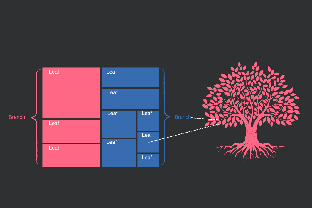
The data used in R is also available in a CSV file at this link. It is part of a great initiative by Professor Vincent Arel-Bundock to gather many interesting R datasets and make them available in CSV format on this page: R Datasets.
Power BI Desktop is free and you can download it from the Power BI Microsoft official page. To learn more about it and how to get started, please consult this resource.
In the lesson Treemaps in R we learnt how to plot a treemap in R. In this lesson we will plot the same treemap in Power BI. To do that, download the data above and save it in the desired folder.
When you open Power BI, you will see the option to load data from an Excel File. You can choose this option and a window will open to select the file with your data. You can then select all files to see also csv files. Select the cholera.csv file and confirm. You will be offered the option to transform your data in Power Query, a tool aimed at preparing your data before visualization. For this lesson, you can skip this step and load the data without transforming its structure.
On the bar to the right, you will see the variables of your dataset. We would like to create a treemap in which we have bigger rectangles representing the regions of London and smaller rectangles representing the districts within their respective region. The size of the rectangles will inform us about the mortality caused by cholera in a given region and district. These are the relevant variables for us:
regionwill define our outer rectangles (categories) and will represent regions of London (West, North, Central, South, Kent);districtwill define our inner rectangles (details), representing the districts of London;cholera_draterepresents deaths caused by cholera per 10,000 inhabitants in 1849 and will define the size of rectangles
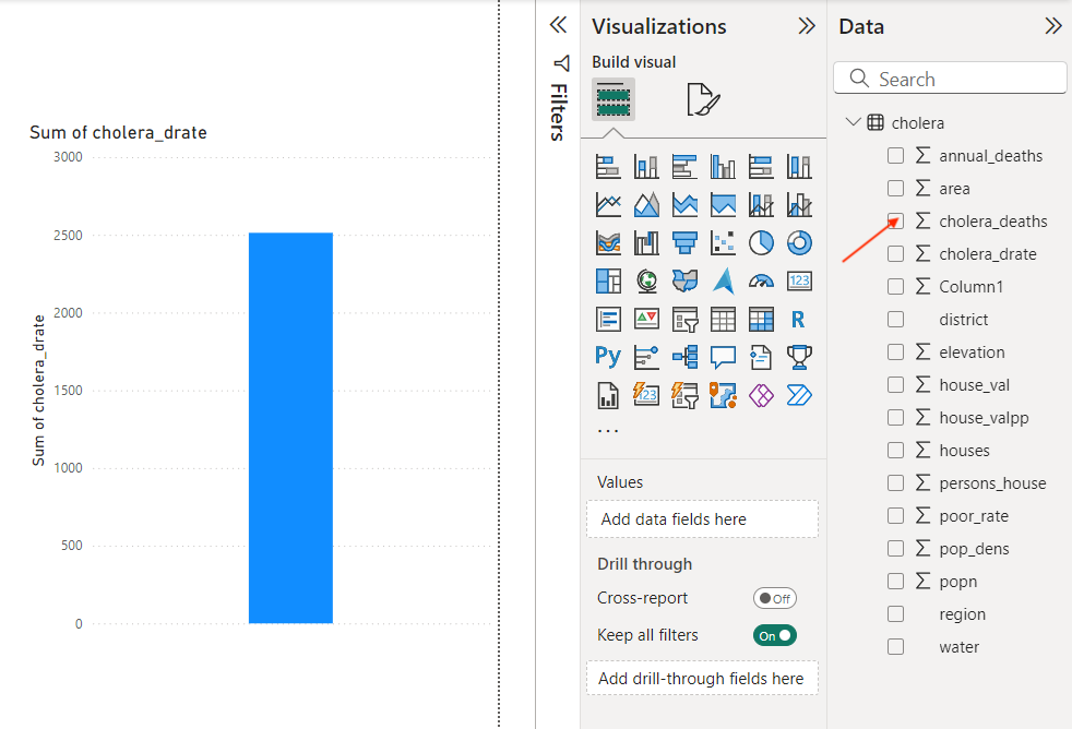
The first step is to select the cholera_drate field, as shown in the image below. You will realise that Power BI automatically creates a bar chart with the sum of all death rates.
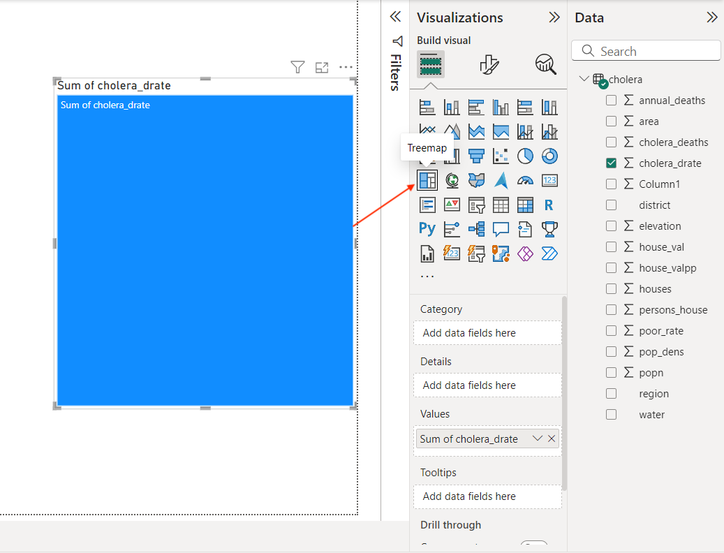
Now, click on the bar plot and select the option Treemap in the Visualization tab, as shown in the image below.
The next step is to define which variable will determine the branches of our treemap, that is, the more general category. In our case, it is region. Finally, we define the field determining the leaves of our treemap. In this example, the leaves are the districts inside each region of London. Drag these two fields to category and details as shown below.
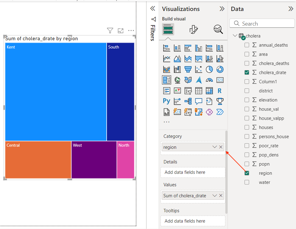
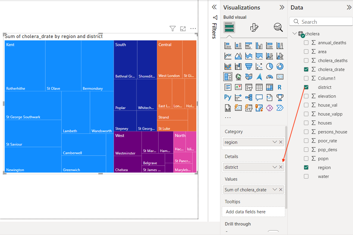
That’s it! Without any line of code, you created a treemap that offers a great visual of London cholera death rates by region and district. You have even automatically generated tooltips that provide additional information about each leaf in your tree. You can further format your plot to have your desired colors, fonts and sizes. Read more about how to format a visualization on this page. Below you see the formatted version of the treemap.
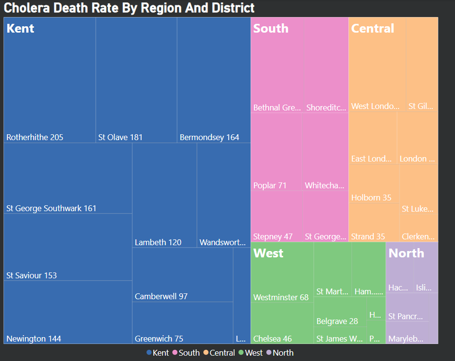
As you have seen, compared to R, it is easier to plot a treemap in Power BI. On the other hand, Power BI customization options are limited compared to R. Please, if you have any question or comments, feel free to write below and I wish you a great learning journey!
4. Conclusions
- Both R and Power BI are great tools for data analysis. While R is more suitable for complex and academic applications, Power BI is user-friendly and produces beautiful visualizations with drag-and-drop actions;
- Deciding whether to use R or Power BI depends on your goals and requirements, and the two tools can complement each other to produce effective results.
Comments
There are currently no comments on this article, be the first to add one below
Add a Comment
If you are looking for a response to your comment, either leave your email address or check back on this page periodically.