Treemaps In R
What you will learn
- Understand what a treemap is;
- Be able to create a treemap in R.
Table of Contents
1. What is a treemap?
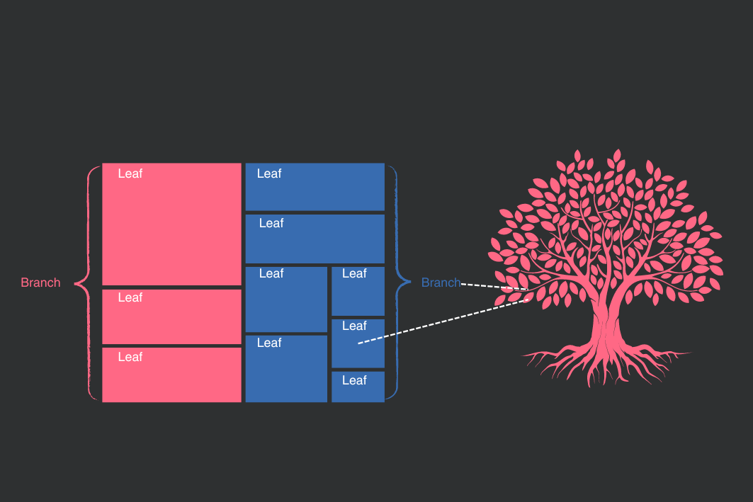
A treemap consists of a set of rectangles that represent different categories in your data and whose sizes are defined by a numeric value associated with the respective category. For example, a treemap could illustrate the continents on Earth, sized according to their population. For a deeper analysis, treemaps can include nested rectangles, that is, categories within categories. Going back to our example of the continents, within each continent rectangle, new rectangles could represent countries and their populations.
You might also think of the more general category — in our example, the continents — as branches of a tree and each branch has its own leaves — in our example, the countries. Below you see a visual representation of the concept behind a treemap.
2. When should you use a treemap?
One of the main advantages of a treemap is that it allows for the interpretation of a large amount of data at a single glance. It is well-suited to show part-to-whole relationships and to highlight the hierarchies in your data. Do not use treemaps when the variable defining the size of rectangles presents little variation.
3. How to plot a treemap in R?
To exemplify a treemap in R, we will use the Cholera dataset, which contains that on the mortality caused by cholera in England in the years 1848-1849. This data comes from the histdata R package. Moreover, you will need to install the treemap package, one of the alternatives to plot a treemap in R. We will also use RColorBrewer package for a color palette and dplyr to transform the data.
After you install the packages, load them and explore the structure of the Cholera data frame.
content_copy Copy
library(HistData)
library(treemap)
library(dplyr)
library(RColorBrewer)

# Load the data to your R environment
data("Cholera")

# Check the dataframe structure
str(Cholera)
We would like to create a treemap in which we have bigger rectangles representing the regions of London (branches) and smaller rectangles representing the districts (leaves) within their respective region. The size of the rectangles will inform us about the mortality caused by cholera in a given region and district. For us, the following variables are important:
regionwill define our outer rectangles (higher hierarchy) and will represent regions of London (West, North, Central, South, Kent);districtwill define our inner rectangles (lower hierarchy), representing the districts of London;cholera_draterepresents deaths caused by cholera per 10,000 inhabitants in 1849 and will define the size of rectangles
The treemap function is used to plot the treemap in R. The main arguments necessary are:
- the first argument is the dataframe;
indexdefines the two levels of hierarchy in our plot: region (our branches) and district (our leaves);vSizespecifies the death rate to define the size of our rectangles;vColorspecifies the region to define the color of our higher hierarchy rectangles;typeinforms the function thatvColoris a categorical variable;- the remaining parameters are used to adjust format options like color palette and position of elements.
content_copy
Copy
treemap(Cholera,
        index=c("region","district"),
        vSize="cholera_deaths",
        vColor = "region",
        type = "categorical",
        # formatting options:
        palette = brewer.pal(n = 5, name = "Accent"),
        align.labels=list(
          c("left", "top"),
          c("right", "bottom")
        ),
        border.col = "white",
        bg.labels = 255,
        position.legend = "none")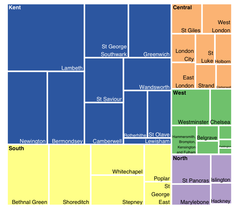
Note that Kent is the region with the largest death rate, followed by Southern London. Moreover, districts like Lambeth and Bethnal Green were especially affected by the disease. This treemap is a powerful tool to give you a general picture of the data at first glance.
If you have any questions, please feel free to comment below!
4. Conclusions
- A treemap is very useful to represent hierarchical relations in your data and provide a quick overall picture of your data;
- Plotting a treemap in R can be easily accomplished with the
treemappackage.
Comments
There are currently no comments on this article, be the first to add one below
Add a Comment
If you are looking for a response to your comment, either leave your email address or check back on this page periodically.