Climate data visualization with ggplot2
What you will learn
- Learn where to find reliable climate data;
- Be able create your own ggplot2 theme;
- Learn how to code ggplot dot and line plots
Table of Contents
Introduction
‘Global warming isn’t a prediction. It is happening.’
James Hansen
There is indisputable evidence that our planet is warming at an abnormal rate. The effects of global warming already started to affect the Earth. Melting glaciers, sea level rise, and intense heat waves already affect several countries. In this lesson, you will use historical weather data to plot graphs that help to raise awareness about climate change.
If you like this topic, please, check ‘R programming for climate data analysis and visualization’ where we present how to use linear models to analyze the link between global warming and the increase in CO2 emissions.
Data Source
Data for this lesson comes from the National Centers for Environmental Information. This institution provides historical weather data by city and country over the last centuries.
Coding the past: graphical data analysis with r
1. Loading historical weather data with fread
First, we will load the temperature database with the R function fread(). Note that there are many variables available (read more about them). However, we are only interested in DATE and TAVG (average annual temperature in Oxford). The select parameter is used to select which variables to load.
content_copy Copy
library(data.table)
library(ggplot2)
library(imputeTS)
library(dplyr)

temperatures <- fread("oxford_temp.csv",
                      select = c("DATE", "TAVG"))
2. Imputing missing values in R
TAVG has missing values and was loaded as character. Let us convert it to numeric and impute missing values with linear interpolation using ` na_interpolation`, available in the imputeTS library.
content_copy Copy
library(imputeTS)

temperatures$TAVG <- na_interpolation(as.numeric(temperatures$TAVG), option ="linear")
If you prefer to skip steps 1 and 2, download here the prepared dataset in .RData format. It will be used for the next steps.
3. What is ggplot2 and the grammar of graphics?
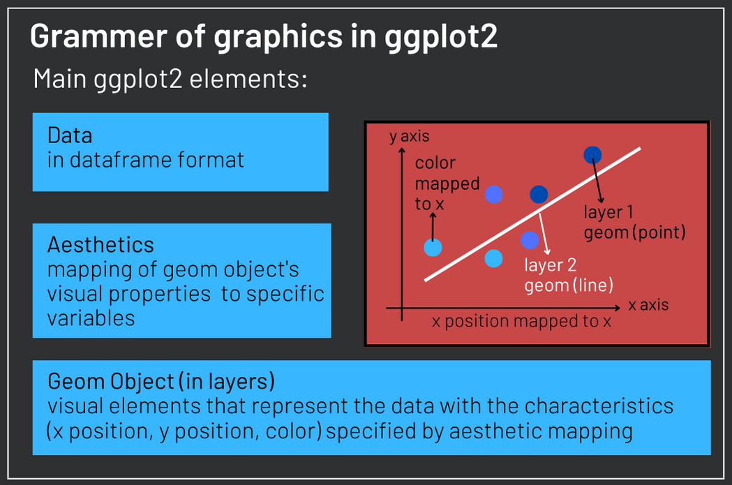
Ggplot2 is an R library to create statistical graphics. It is based in the grammar of graphics, a tool to understand graphics as a set of components which together give you flexibility to create original visualizations.
In the figure bellow, you see the 3 main elements of ggplot2. First, you need a dataset with variables. Each of these variables can be mapped to one particular aesthetic - a visual property of a geom object. Geom objects are the elements you see in your graph (line and dots, for instance). Their characteristics (position on y axis, position on x axis, color, size, etc.) are defined by aesthetics mapping. One graph can contain several layers, each one with a geom object.
4. ggplot2 dotplot
In this section, we will use ggplot2 to depict the historical temperatures in the city of Oxford from 1815 to 2022. We will use points do identify the temperature over the years. Although we usually use line plots to represent time series, some researchers claim that the lines do not represent observed data. Actually lines only connect the dots. Therefore, in this lesson, you will learn to plot time series both with dots and with lines.
The ggplot() function will contain two arguments. The first is the data and the second is aes() (aesthetics), which maps the position on the x axis to the variable DATE, the position on the y axis to TAVG and color to TAVG, meaning the color of the geom objects will depend on average annual temperature. After the mapping, we add the first layer of our plot with geom_point(). The points represent the observations in the dataset with x and y position as well as color defined by the mapping we set. Two additional layers set x and y axis names.
content_copy Copy
ggplot(data = temperatures, aes(x= DATE, y = TAVG, color = TAVG))+
  geom_point()+
  xlab("Year")+
  ylab("Annual Mean Temperature in Oxford [ºC]")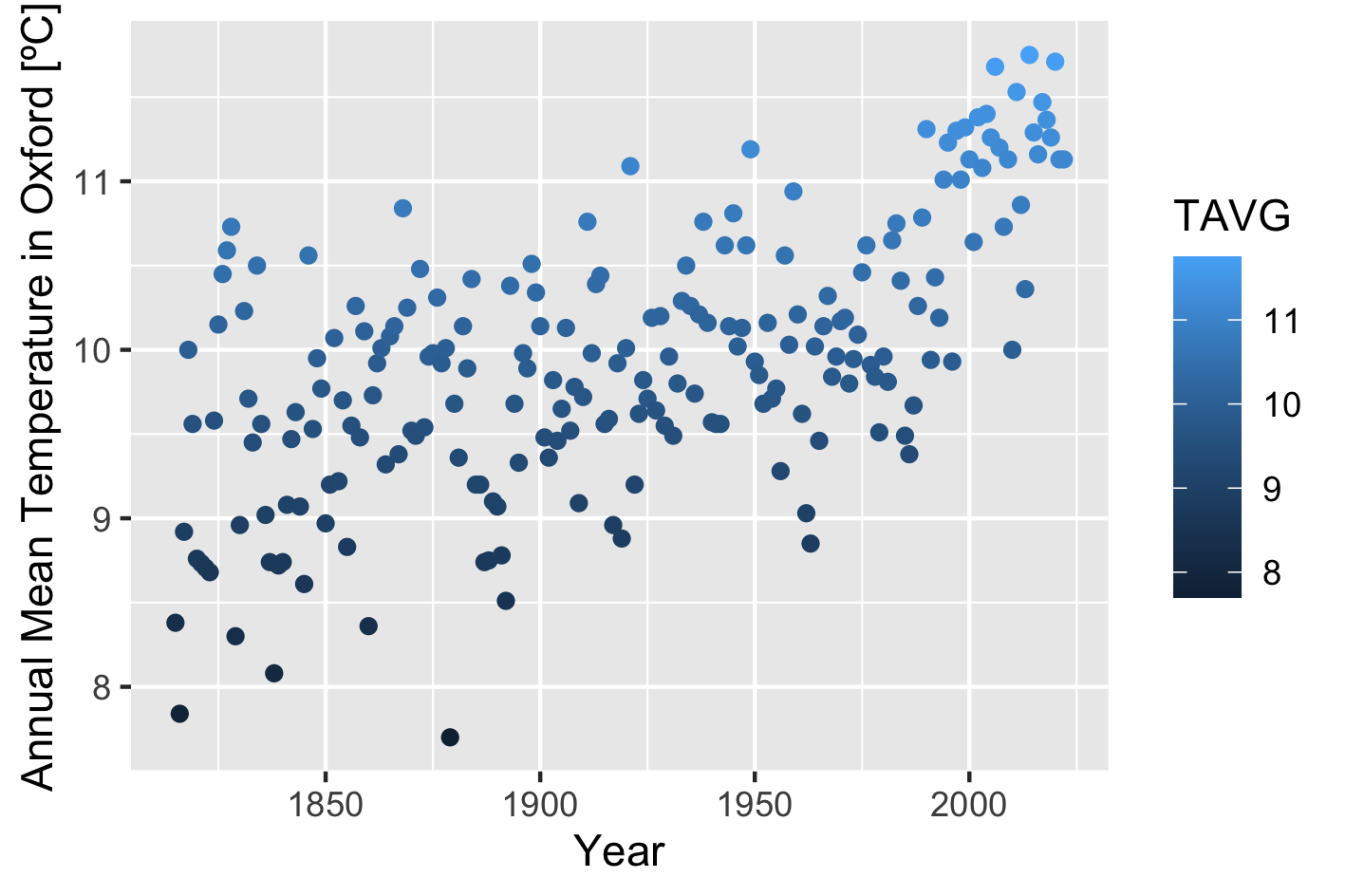
5. Setting colors with scale_color_gradient
One improvement could be representing lower temperatures with blue colors and higher temperatures with red. Moreover this default behavior is not intuitive, since darker colors are usually associated with larger quantities and not otherwise. Note that TAVG is a numeric variable and when we map it to color, ggplot uses a gradient to color the geom object. Adding the scale_color_gradient() layer allows us to define the color associated with low and high values. Moreover, it allows us to choose the name of the scale:
content_copy Copy
ggplot(data = temperatures, aes(x= DATE, y = TAVG, color = TAVG))+
  geom_point()+
  scale_color_gradient(name = "ºC", low = "#1AA3FF", high = "#FF6885")+
  xlab("Year")+
  ylab("Annual Mean Temperature in Oxford [ºC]")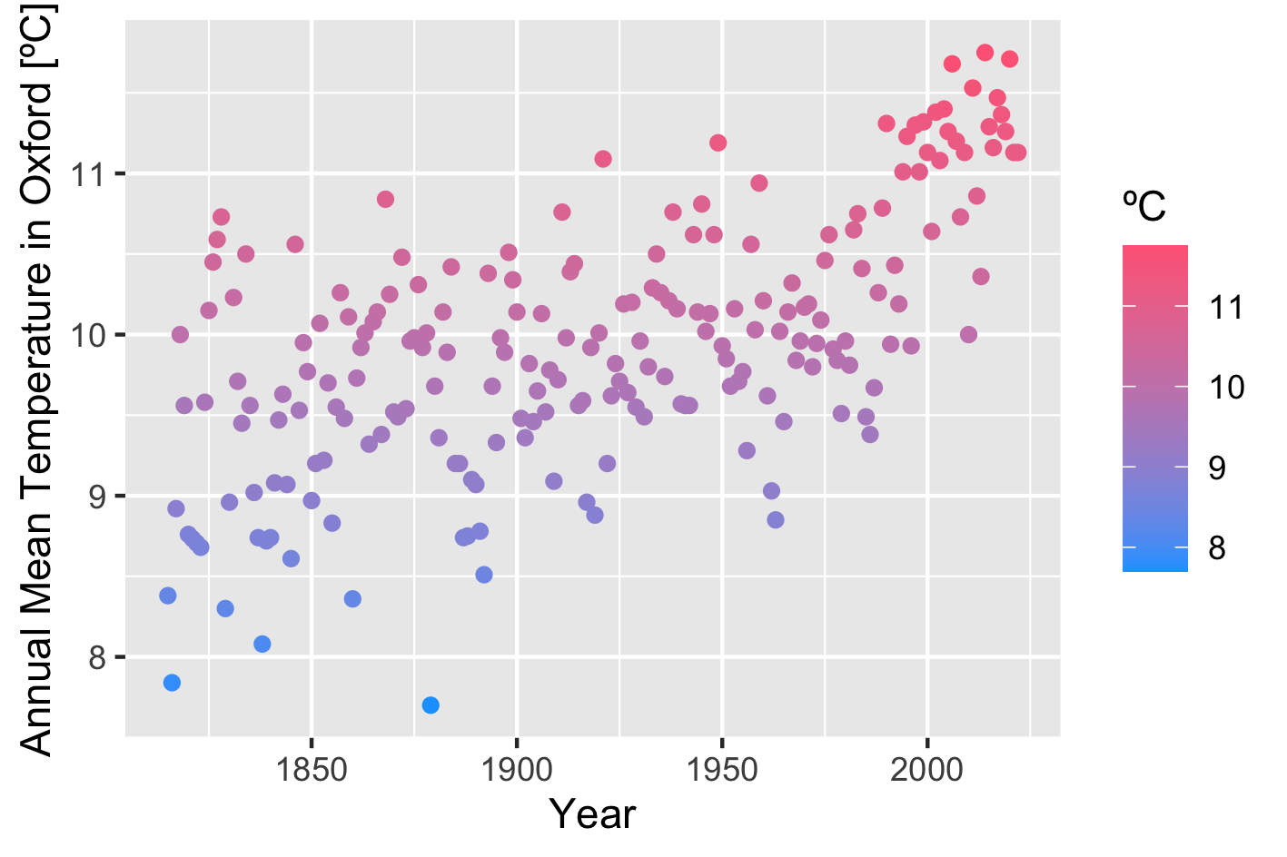
6. Create your own ggplot2 theme
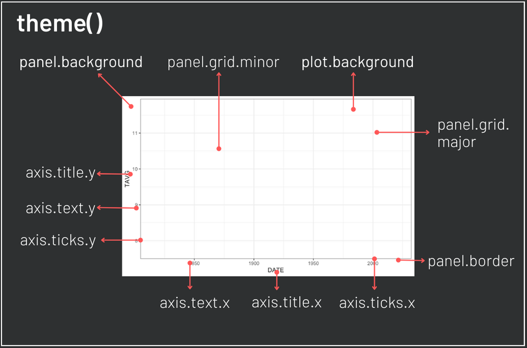
The plot above got a little better, but how to customize it further? There are several R packages providing ggplot2 themes, but if we would like a theme that matches the theme of this page, for example, what could we do? An option is to create our own theme with the theme() layer. theme() offers several arguments to create your style. In the figure bellow you can see the arguments necessary to change the background and text color of the elements in our plot. Moreover, there are arguments to eliminate grids.
A theme can be created by a customized function which executes the ggplot theme(). In the code bellow you can see that the theme is built starting from the black and white ggplot2 theme.
content_copy Copy
theme_coding_the_past <- function() {
  theme_bw()+
  theme(# Changes panel, plot and legend background to dark gray:
        panel.background = element_rect(fill = '#2E3031'),
        plot.background = element_rect(fill = '#2E3031'),
        legend.background = element_rect(fill="#2E3031"),
        # Changes legend texts color to white:
        legend.text =  element_text(colour = "white"),
        legend.title = element_text(colour = "white"),
        # Changes color of plot border to white:
        panel.border = element_rect(color = "white"),
        # Eliminates grids:
        panel.grid.minor = element_blank(),
        panel.grid.major = element_blank(),
        # Changes color of axis texts to white
        axis.text.x = element_text(colour = "white"),
        axis.text.y = element_text(colour = "white"),
        axis.title.x = element_text(colour="white"),
        axis.title.y = element_text(colour="white"),
        # Changes axis ticks color to white
        axis.ticks.y = element_line(color = "white"),
        axis.ticks.x = element_line(color = "white")
  )
}
Let us now try our theme:
content_copy Copy
ggplot(data = temperatures, aes(x= DATE, y = TAVG, color = TAVG))+
  geom_point()+
  scale_color_gradient(name = "ºC", low = "#1AA3FF", high = "#FF6885")+
  xlab("Year")+
  ylab("Annual Mean Temperature in Oxford [ºC]")+
  theme_coding_the_past()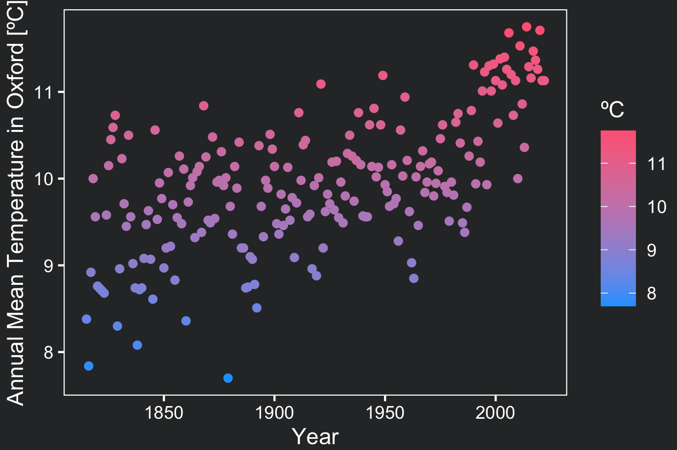
The plot fits the page and highlight the data a lot better now. You could still increase the size of your point geom objects to highlight them. When you do not want to map a certain aesthetic to a variable, you can declare it outside of the aes() argument. Bellow, two changes are made in the point geom objects. First, alpha adds transparency. Second, size increases the size of all the points (without mapping).
content_copy Copy
ggplot(data = temperatures, aes(x= DATE, y = TAVG, color = TAVG))+
  geom_point(alpha = .5, size = 5)+
  scale_color_gradient(name = "ºC", low = "#1AA3FF", high = "#FF6885")+
  xlab("Year")+
  ylab("Annual Mean Temperature in Oxford [ºC]")+
  theme_coding_the_past()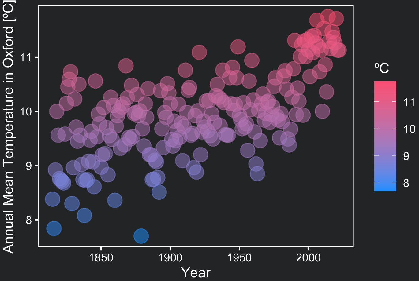
7. Adding a second layer containing ggplot line
Now we will make use of the flexibility of the grammar of graphics to add an additional layer to our plot. This time we will add a geom line object:
content_copy Copy
ggplot(data = temperatures, aes(x= DATE, y = TAVG, color = TAVG))+
  geom_point(alpha = .5, size = 3)+
  geom_line()+
  scale_color_gradient(name = "ºC", low = "#1AA3FF", high = "#FF6885")+
  xlab("Year")+
  ylab("Annual Mean Temperature in Oxford [ºC]")+
  theme_coding_the_past()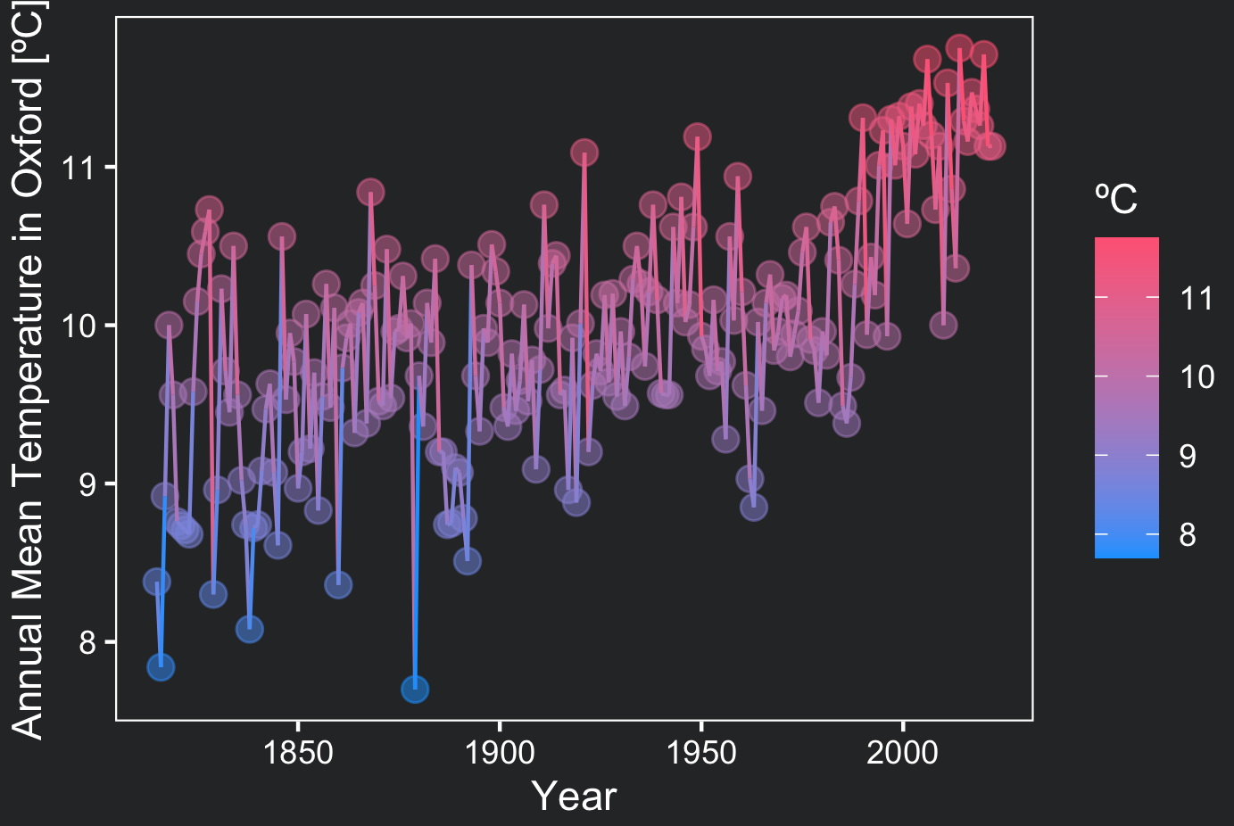
Weather data visualization makes it clear that average temperatures are increasing year by year!
Conclusions
- Ggplot2 creates effective statistical graphics making use of layers to produce flexible and original visualizations;
- Follow two basic steps to plot in ggplot2:
- map your variables to the desired aesthetics (visual aspect of a geom object);
- create the layers containing the geom objects;
- Use
theme()to create your own customized theme;
Comments
There are currently no comments on this article, be the first to add one below
Add a Comment
If you are looking for a response to your comment, either leave your email address or check back on this page periodically.